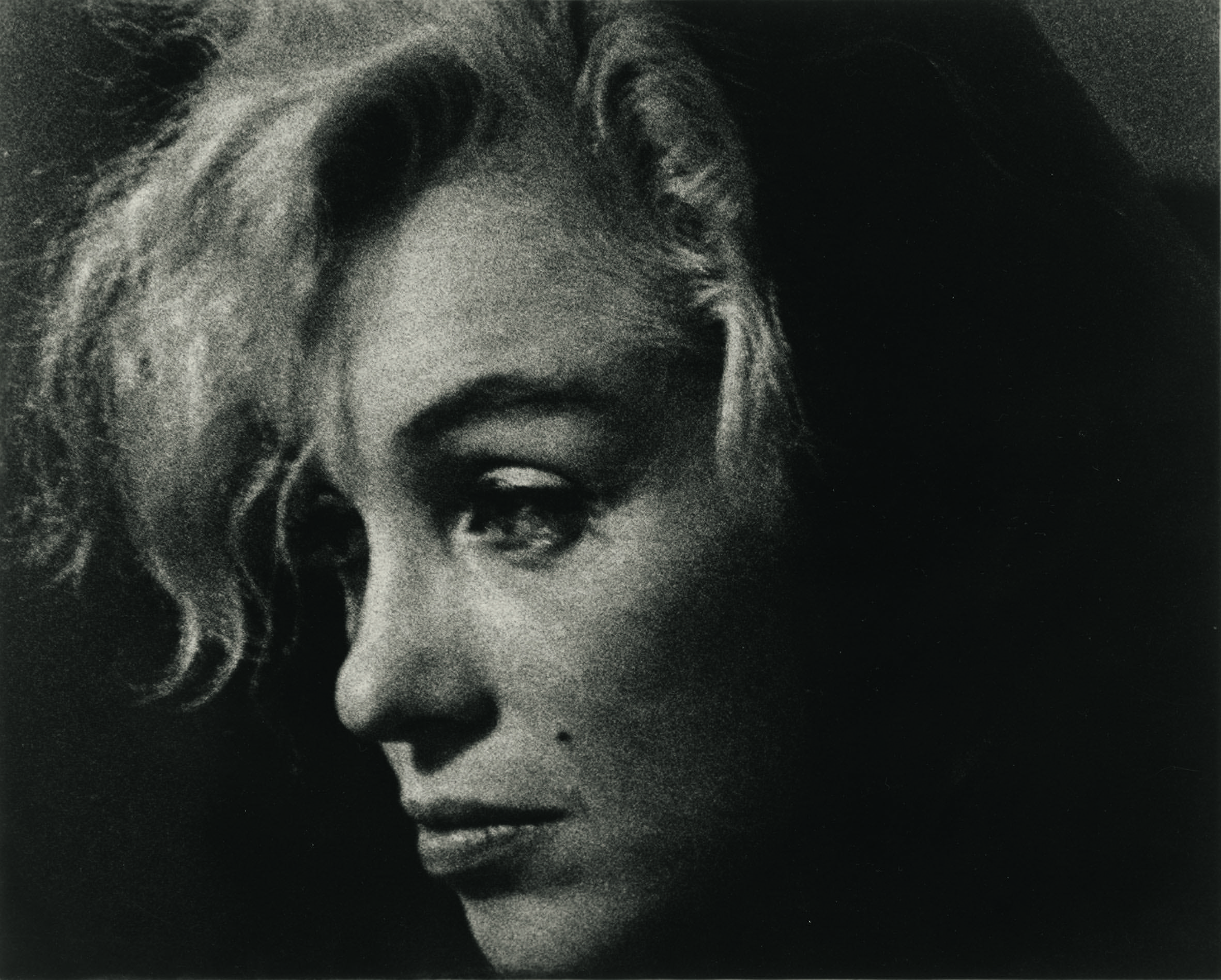
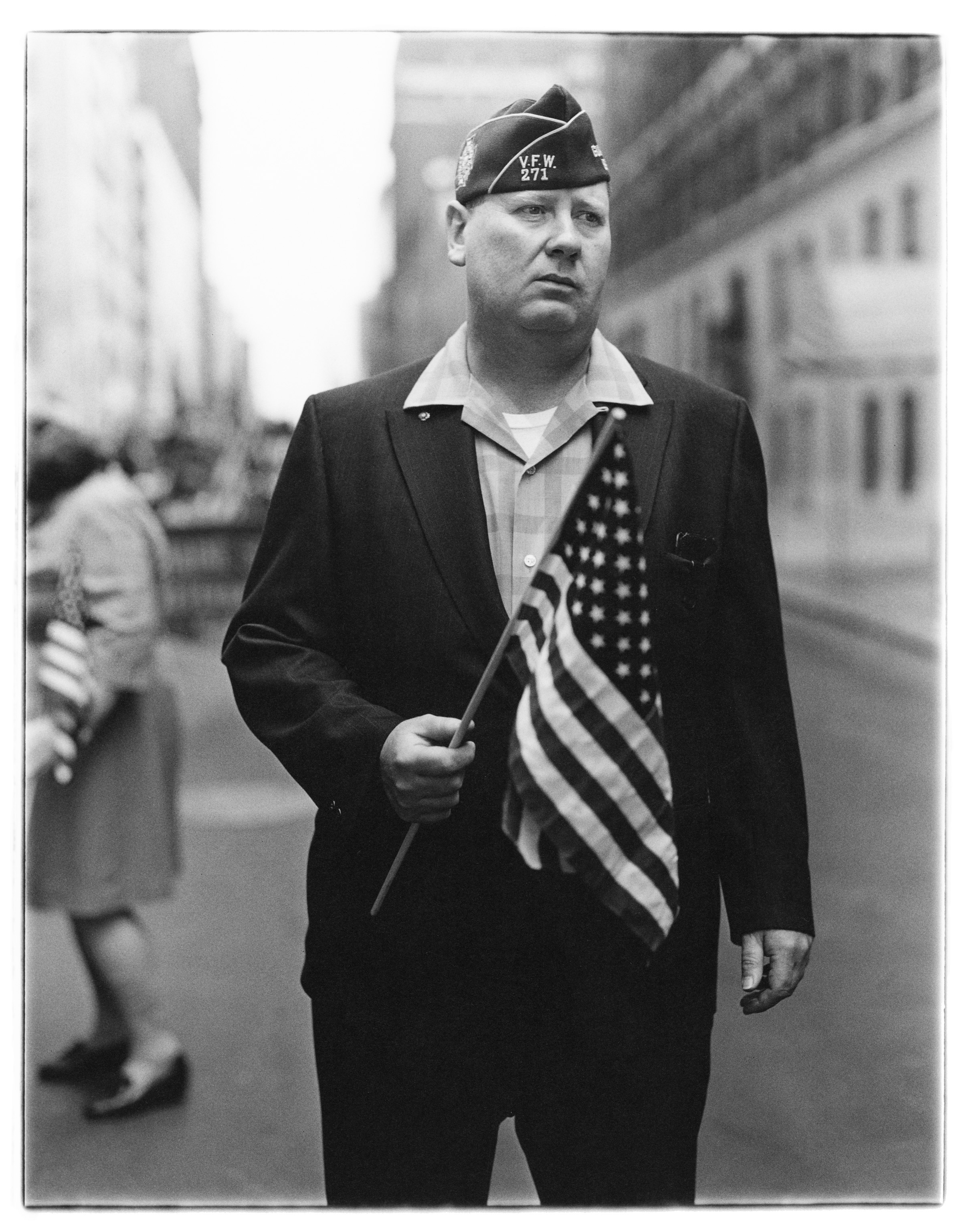
Self-Portraits, Sam Wagstaff, 1973 (The Getty Research Institute, Los Angeles (2005.M.46)
In Wagstaff: Before and After Mapplethorpe, Philip Gefter’s new biography of collector, curator, and market force Sam Wagstaff, the author argues that it was not only his subject’s life that was transformed by his relationship with Robert Mapplethorpe. Before Mapplethorpe, Gefter writes, photography was “an art world bastard, a utilitarian medium” and an inconsequentiality in the market. According to Gefter, the photography world today, its revered place within the art world, and the photography market as we know it is due at least as much to Wagstaff’s efforts as to those of his contemporary, the more known and lauded John Szarkowski, writer, curator, and Director of Photography at the Museum of Modern Art.
Before and After Mapplethorpe portrays a single love affair in a way that invites and rewards both an uplifting, romantic view of love and a cynical, near-infuriating view of the art world. Before meeting Mapplethorpe, Sam Wagstaff was already respected as a curator and collector, after tenures at the Wadsworth Atheneum and Detroit Institute of Arts (DIA). He had achieved notoriety for a groundbreaking exhibit at the former (“Black, White, and Gray,” the very first museum show of Minimalist art) and an ambitious failure at the latter (“Dragged Mass Displacement,” Michael Heizer’s 30-ton granite block installation intended to sink into the DIA’s front lawn but which merely sat atop it). But for all his prescience and independence of thought, which “Black, White, and Gray,” especially, had testified to, Wagstaff disdained photography, like most of the art world at the time. What little attention he gave to the medium — for instance, his first purchase of a photographic work of art, Andy Warhol’s “Race Riot” — was motivated by the new ways in which the medium riffed on painting and conceptual art, and not by any virtues unique to the medium itself. Indeed, Wagstaff described himself as a “loather of photography, sui generis” in his recommendation letter for Enrico Natali’s Guggenheim Fellowship (for photography) in 1971.
It was only when Wagstaff began his relationship with unknown photographer Robert Mapplethorpe that he started to regard photography as a worthy art in its own right. Wagstaff’s fascination with the young artist spread to the artist’s field, and, galvanized by passion, he applied his habitual scholarly diligence, his lordly confidence in “the essential rightness of his eye,” and his wealth not only toward the advancement of his protégé’s career but, successfully, toward the elevation of photography as an art form worthy of veneration equal to any in the canon, as well as a market force. Love, as all its platitudes have taught us, alters us, opens our eyes to new possibilities, expands our worlds, and propels us to great achievements.
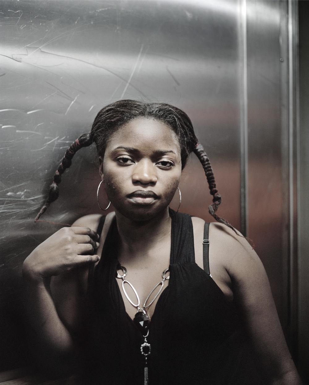
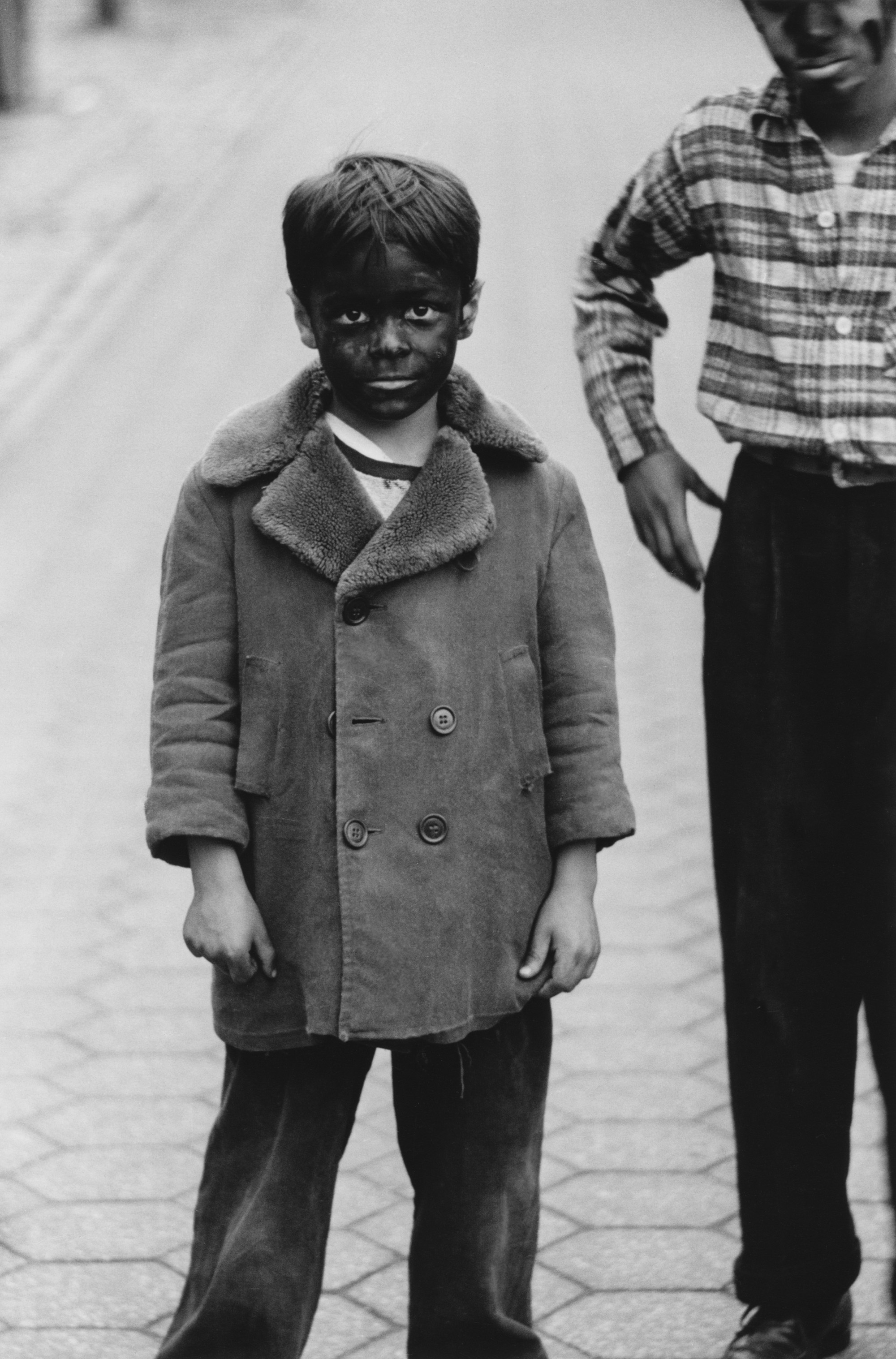
Robert Mapplethorpe, Self Portrait, 1980 (courtesy of Wikipedia)
On the one hand, Gefter seems to be saying, love is a many-splendored thing. On the other, the art world is a miasma of sexual nepotism, auction rigging, cronyism, rank-pulling, and let’s not forget, sexism. Yes, Wagstaff displayed formidable knowledge, eagerness to learn, daring, and enthusiasm in every area of art he curated or collected, and towards the end of the book when one reads that he confessed to good friend Patti Smith before his death that he had loved only three things in his life, “Robert, my mother, and art,” one believes him. Yet imagine attending Photographs from the Collection of Sam Wagstaff at the Corcoran Gallery of Art in 1978, an exhibit of the influential figure’s collection, deemed museum-worthy for its scope, its richness in works seminal to their respective places in the history of the medium, but most of all because it includes the chosen — curated! — favorites of a mind that has husbanded photography to a position of greater importance and visibility in the public sphere than ever before. Imagine, also, that Wagstaff has implemented two shows within the same museum in tandem with the exhibit, showcasing works by his faithless boyfriend and protégé, Mapplethorpe, and by another, largely unknown artist, who is the current object of his unrequited infatuation — Gerald Incandela, and to whom Mapplethorpe has reason to worry he might lose Wagstaff’s affection and, thereby, patronage. The powerful man at the vertex of this love triangle pits his two acolytes against each other professionally in a Cain and Abel-like fashion (author’s simile). How would you feel being asked to stroke your beard cogitatively and speak in respectful tones and Artforum words about this bald-faced personal drama of low-road power plays and petty sadism?
Equally unsettling, the Berkley Art Museum and Pacific Film Archive, a major institution, exhibited works from Mapplethorpe’s private collection and then, later that same year, hosted “Photographs from the Collection of Sam Wagstaff.” As if the conflict of interest weren’t outrageous enough, Wagstaff had even paid for some of the works in Mapplethorpe’s collection when the photographer couldn’t afford the pieces he desired at auction. What Gefter describes as having “an air of cronyism” about it in fact appears even more lopsided than that: Wagstaff’s money and influence basically bought out a major portion of the museum’s display that year.

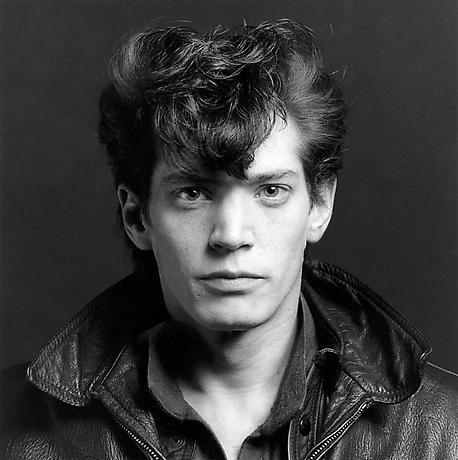
Sam in his apartment at Lafayette Towers, Detroit, c. 1970 (photo by Enrico Natali)
Of course photography’s ascendance in the art world is both propelled by and reflected in its performance in the market, particularly as several of its advancements have come in the form of museum shows driven by collectorship rather than the other way around. As Susan Sontag described in her talk at “Photography: Where We Are Now,” a symposium organized in conjunction with Wagstaff’s Corcoran show, the active role of the market in establishing photography’s place in the art world was unlikely to leave the critical discourse around it unsullied: “Would money become a determining factor in concluding a photographer’s significance?” It seemed so, though Gefter makes a persuasive case that this should not impugn Wagstaff’s taste or intentions in his collecting habits or championing of artists. The effects of the market, particularly of auctions, determine not only the monetary but the historical value of works (as well as that of works that never make it to the market), manipulating public perception of the photographic universe and its values. However one feels about that, it was Wagstaff and a small coterie of similarly moneyed and obsessive collectors and dealers who set the photography market in motion. They used unsurprisingly self-serving tactics, even the ‘auction ring,’ a way of minimizing competition at auctions which was illegal in the market at large, but which passed under the radar at a time when the rules for the photography market in particular were still unwritten. Amongst themselves, they manufactured that worldwide marketplace in which their own collections flourished and appreciated.
But Sontag’s worry that money might have an outsized role in determining a photographer’s significance seems no less relevant today. A prestige venue like Pier 24 invites the same worry: it upholds the reputations of established artists and enhances the profiles of emerging ones, but is bankrolled by a single collector — the power to influence the public’s consciousness of the state of photography today, concentrated in an aging white man’s wallet. It is one of the least defensible aspects of Wagstaff’s legacy, as is the Pier’s focus on male artists, taking after Wagstaff’s similarly narrow exhibition forty years earlier. (continue reading)

Sam with Tony Smith at the Wadsworth Atheneum, mid-1960s (Courtesy of The Wadsworth Atheneum of Art)